Case Study

Changing the last two pages that matter most

Changing the last two pages that matter most

Hero image featuring a website on the laptop

The Project

Refreshing review and checkout without losing momentum at the funnel's most fragile step

Review and checkout sit at the end of the funnel, where every UX decision shows up directly in the numbers. As part of the brand rollout, the UX team refreshed both pages simultaneously, using the brand window as cover to address pain points the team had been watching for some time. Leading the design vision and cross-sell strategy across the team and owned the post-launch metrics end to end, partnering with engineering, analytics and commercial throughout.

Product

Refreshing Review & Checkout

Project

Review and Checkout

Year

2025

Focus

Product & UX Vision, Cross-sell Strategy, Risk Mitigation, Team Lead

The Project

Refreshing review and checkout without losing momentum at the funnel's most fragile step

Review and checkout sit at the end of the funnel, where every UX decision shows up directly in the numbers. As part of the brand rollout, the UX team refreshed both pages simultaneously, using the brand window as cover to address pain points the team had been watching for some time. Leading the design vision and cross-sell strategy across the team and owned the post-launch metrics end to end, partnering with engineering, analytics and commercial throughout.

Product

Refreshing Review & Checkout

Project

Review and Checkout

Year

2025

Focus

Product & UX Vision, Cross-sell Strategy, Risk Mitigation, Team Lead

Outcomes

The impact in numbers.

0%

0%

increase in funnel continuation

0%

0%

increase in insurance attachments

0x

0x

reduced user errors

0%

0%

additional member logins
Real Problems We Faced Heading In

How do you improve an existing checkout page that is letting customers down at the final stage of their transaction?

Problem Statements

Review and checkout worked. They didn't work as hard as they could.

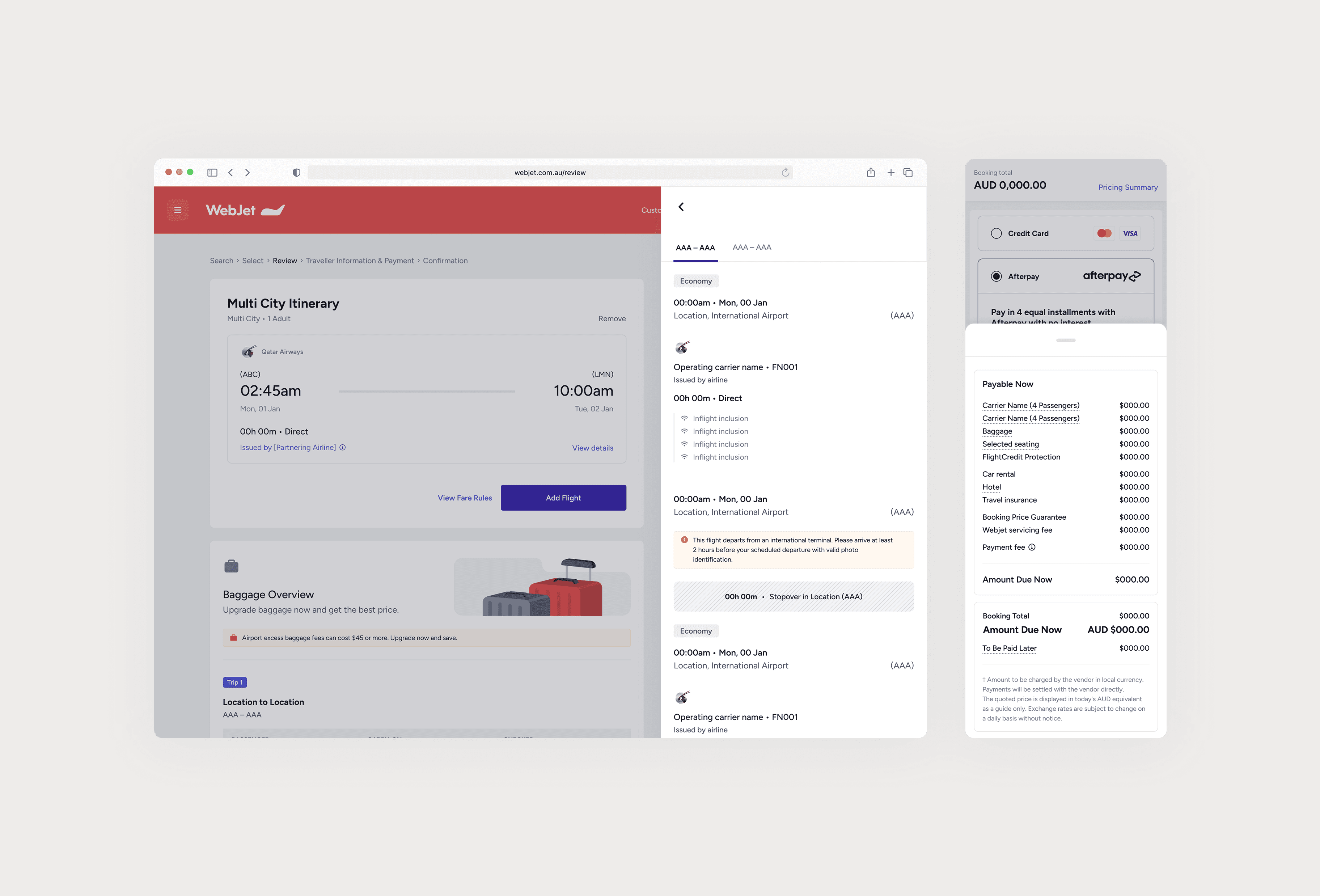
The price breakdown sat buried at the bottom of the page. The thing customers most wanted to see was the last thing they found, stranded beneath upsell content.

The payment form was too long and too dense. Every field presented at equal weight, with backend inconsistencies still bleeding into the frontend experience.

The price breakdown badly needed a redesign. The most complex, scenario-heavy component on the entire platform, handling every booking permutation a customer can make, on top of the compliance risks the current version was straining to address.

Getting it nearly right was not an option.

Real Problems We Faced Heading In

How do you improve an existing checkout page that is letting customers down at the final stage of their transaction?

Problem Statements

Review and checkout worked. They didn't work as hard as they could.

The price breakdown sat buried at the bottom of the page. The thing customers most wanted to see was the last thing they found, stranded beneath upsell content.

The payment form was too long and too dense. Every field presented at equal weight, with backend inconsistencies still bleeding into the frontend experience.

The price breakdown badly needed a redesign. The most complex, scenario-heavy component on the entire platform, handling every booking permutation a customer can make, on top of the compliance risks the current version was straining to address.

Getting it nearly right was not an option.

Delivering Results Without The Risk

How We Delivered

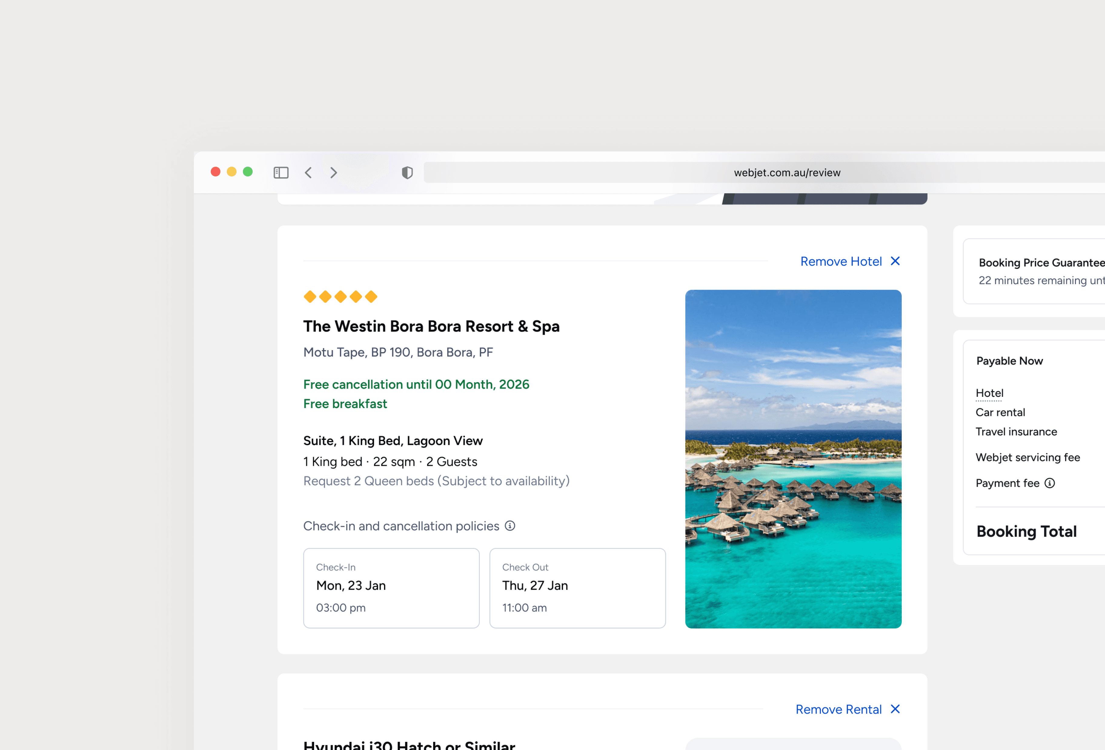
On review, the price breakdown became a sticky component that scrolls with the page, keeping what customers most wanted to see in view the whole way down. The call came from heavy A/B testing and research, not assumption. The widget itself was rebuilt from the ground up to handle every booking permutation and compliance scenario, built to be the ecosystem-wide variant from day one. Upsell content was rebalanced so the page reviewed first and sold second.

On checkout, progressive disclosure collapsed completed sections and secondary fields, keeping customers on the next decision rather than the full picture at once. We partnered with engineering to fix the backend inconsistencies at the source, so the frontend could present them cleanly rather than design around them.

Next-phase concepts began breaking the journey into discrete decision points to cut fatigue further. I owned the post-launch metrics directly, running weekly reviews with stakeholders and pivoting where the data called for it.

Strategy, craft, and delivery, end-to-end.

Design leadership that holds the thread from problem to outcome. If you need someone who can lead from the front without losing the craft, you've found them.

2026 · Rob Nastos · Product Design Leader

Strategy, craft, and delivery, end-to-end.

Design leadership that holds the thread from problem to outcome. If you need someone who can lead from the front without losing the craft, you've found them.

2026 · Rob Nastos · Product Design Leader

Strategy, craft, and delivery, end-to-end.

Design leadership that holds the thread from problem to outcome. If you need someone who can lead from the front without losing the craft, you've found them.

2026 · Rob Nastos · Product Design Leader